Sidebar
Website Timeline
number of HTML tricks known: too many
Ok, no one should be interested in this except me, but because I tend to be a packrat when it comes to online data, I've made a respository for all my old websites (that I could find).
I have no idea on dates, but they're sorted chronologically, to the best of my ability.
My designs evolved with the HTML standards, I'm so glad not be stuck in the HTML 3.0 days.
- Earliest Known
-
Unfortunately, I've lost anything I had before this. I remember it consisted mostly of animated gifs downloaded from the internet. And an image of a ship from Descent 2, the crowning glory of my site.
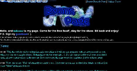
Anyway, as I enjoyed helping out in my school's computer lab and I was just teaching myself javascript, I decided to make a site to help others. (as an online extension of my love of technology and helping others. get it?)
I was a young (male) Mother Theresa. With a terrible grasp of colors.
The missing images on the bottom were simple animated gifs that used javascript onMouseOvers to cause the image to appear to spin when you moved the mouse over it. I actually learned how to do that from stepping through the javascript code on the id Games website.
Remember how I said I was teaching myself javascript? That's why there's some very annoying scripts on that page. I also never got beyond making the first page. So much for helping others.
- Personal Site (version 1)
-
In my freshman/sophmore year of high school, I created a personal site. The design changed often, but this is one of the earliest. I guess digitalXen is the latest iteration of it.
You'll notice I was opinionated. I still am, though I can string sentences together a bit better now.
Cuz I's edukated.

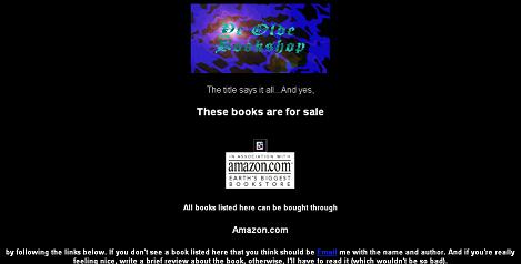
- Book Review (version 1)
-
This book review site was quickly replaced by a new version. I think it lasted all of one month. I felt like writing something that had a purpose, and might actually get people to come look at the site. Of course, it would have helped to put more than seven book reviews up, but I got busy.
Some images have been lost. Don't know what happened to them. Also, I felt it necessary to thank Direct Connect, our ISP at the time. We paid them to host our site, so I don't really know what that was about.
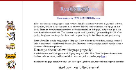
- Book Review (version 2)
-
I realized pretty quickly how sucky the first version was, so I did a major design update. Plus I wanted to see just what frames and tables could do. I'm still proud of the look of the site. It's clean, provides a reasonably "book" look, and it's easy to read. Even if it does use frames.
The images on the left are modified clipart images. I think this is my last site to use images I didn't create.
I was becoming more comfortable with javascript at this point, though I still used scripts written by others and modified them as I needed.
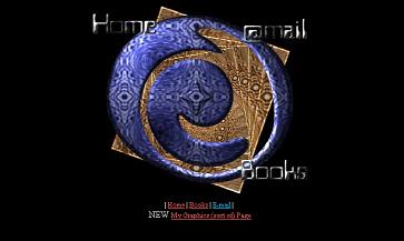
- Personal Site (version 2)
-
I added frames and a menu. The menu underwent a few different changes, but this is the only version I still haved saved.
I began doing splash pages for this site as well, which you'll see below. That became more fun for me than actually working on the content of the site.
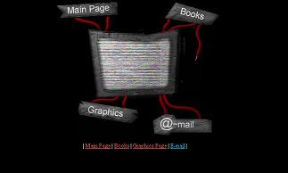
- Abstract (Splash Page 1)
-
My first splash page. At this point I was enjoying graphics more and more, and had found a few sites that combined graphics, fancy tables, and a little javascript to make interactive menus and other fun little things. This was my first attempt at it.
All the components were created in photoshop, then I used ruler guides to partition the image into the sections needed to fit into a table. As this was my first attempt, I tried to keep the table layout simple.
- TV (Splash Page 2)
-
Having grown tired of my first splash page, I wanted to try a version that at least looked like "something." Plus I was reading some tutorials online about creating wires and "dirty" looking textures in Photoshop. Hence the TV splash page was born.
Some pointless details: The static is a 3 frame animated gif. 2 frames made the static look too fake. 3 is still pretty bad, but it enhanced the effect to a bearable level.
I actually took a headshot of myself and added noise over it, so as to have an actual "signal" behind the static.
I also began placing the "X" symbol at the bottom right of my splash pages at this point, just as a way of branding them. I went back and added it to the Abstract splash page later.
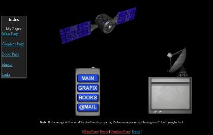
- Satellite (Splash Page 3)
-
This was my third and final splash page. It arose, like the others, out of boredom.
This one was the most fun to work on. I used Bryce to create the satellite and satellite dish, everything else was done in Photoshop. I did screw up the animation of the wings, which were supposed to move in tandem. In attempting to fix it, I added a graphical bug which made the left wing show a bit of the laser where it shouldn't. As well, it took a chunk out of the laser beam when it's turned on.
I enjoy everything else about this image (I especially like the animation when the TV changes channels), but I can't get past that stupid little bug. Kind of ruins it for me.